Company polos are one of our most common orders, and they’re also where people make the most avoidable mistakes. The wrong fabric puckers under embroidery, the wrong fit looks sloppy, and the wrong color hides your logo. Here’s how we help teams choose well.
Fabric decides how it embroiders
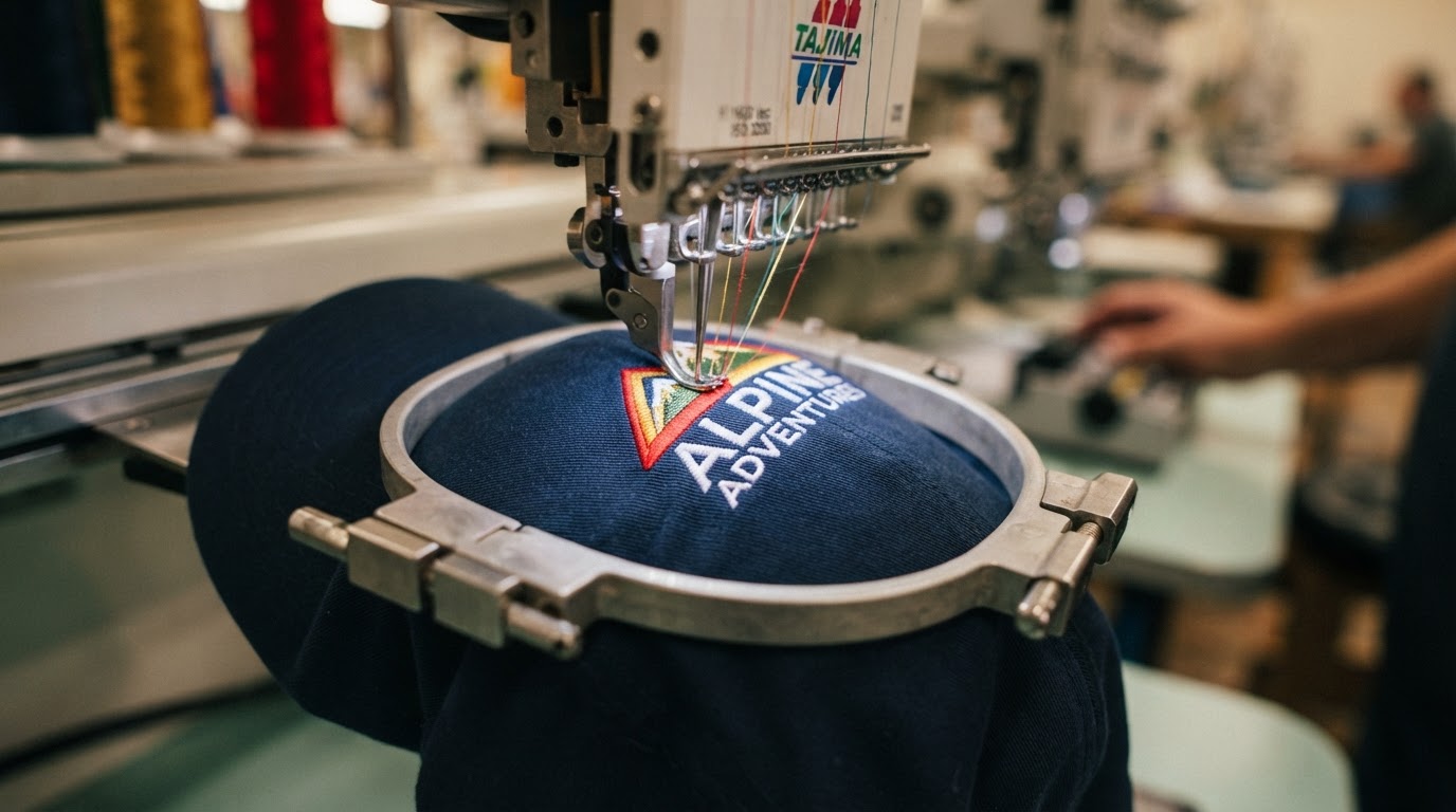
Pique knit is the classic polo texture and it embroiders beautifully. Smooth jersey polos look more modern and lay flat, but they can show puckering if the digitizing isn’t dialed in. Performance moisture-wicking fabrics are great for active teams but need a lighter stabilizer so the stitch doesn’t distort the stretch.
We match the backing and stitch approach to the fabric, which is something you only get when digitizing and embroidery happen in the same shop.
Weight and feel matter more than price
A heavier-weight polo holds its shape, resists wrinkles, and makes a logo look crisp. A cheap, paper-thin polo wrinkles fast and can make even good embroidery look tired by midday. We always recommend stepping up a tier on fabric — the per-piece cost difference is small and the uniform lasts twice as long.
Logo placement and size
Left-chest is the standard for a reason — it reads as professional and it stays visible. For larger logos, a full back or right-chest balance can work. Keep the left-chest mark around 2.5 to 3.5 inches wide; bigger than that and it starts to fight the polo’s lines.
We’ll mock up placement on your proof so you see exactly where it lands before we stitch.
Color contrast is everything
If your logo is navy on a navy polo, no amount of skill makes it pop. We’ll flag low-contrast combos and suggest a thread color tweak or a different shirt color. The goal is a uniform people are proud to wear — not one that hides your brand.
Want this done for real?
We make all of this in-house on Water Street in Henderson. Bring us your logo or your idea and we'll quote it straight.